Design Hero Project 02: Booklet
The next phase of this project was to design a 16-page booklet about your favourite designer. Although I spent the time between the end of the poster project and the start of this project being very eager to learn more about the medium, I very quickly found myself feeling stuck due to my limited knowledge of print design. During my research into this medium, I had a lot of trouble finding designs that really resonated with me. Looking back, the few works that I still remember vividly were the girls’ life magazines I religiously flipped through before I had access to a phone or computer, which was still very young . Even then, I don’t think that I should only be using teen vogue as my sole source of inspiration.
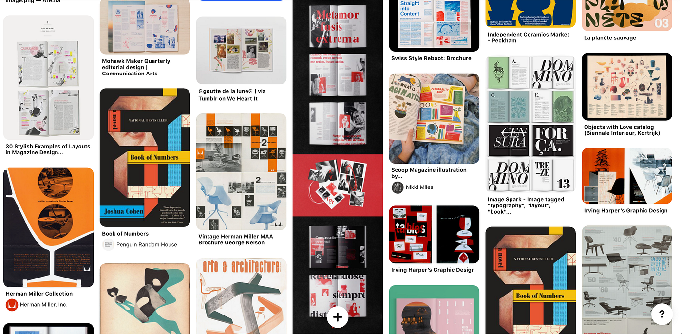
Because the pandemic hasn’t really given me a great chance to go to any book stores to flip through some cool print work, the next best thing I was able to do was look for inspiration through Pinterest.
While these works were great, I still didn’t feel like I found something that was particularly memorable to me and made me think wow, this is the type of work I want to be doing!
Thumbnails/Flatplans
Going into my sketch/thumbnails, I decided that if I wasn’t able to commit to a specific visual style, I would try to focus on a certain aspect of design in each iteration and see what I could take from each of them. Each set of thumbnails focused on a different thing: Color, Composition, and Graphical Elements. I also made one iteration that was an attempt at the combination of the three elements. While this was an interesting exercise to do that made the process of ideation much easier for me, I still had the extra step of combining what I learned from making each iteration into one visual language that I would be happy with.


I made four flat plans in total, all of which focus on different things.
First: Nothing in particular, just going with my gut reaction, focusing on which ideas came to mind first.
Second: Combination of text and graphics
Third: Overall composition, layout and flow
Fourth: Colour
In class, Brett suggested to us that we should start with one spread that we had the clearest idea and worked outwards from there.

Aside from the front and back cover, this was the spread that came the most quickly to me. After fleshing it out, I wasn’t super happy with the stylistic choices I made (personal taste). However, I got some good reactions to it so I decided to trudge along.


Some more iterations that this spread went through. I wanted to see how I could create visual interest and break up the composition. I settled on the textured black theme that seemed interesting enough to move forward with.

I got pretty good feedback from crit. There were comments about how my use of colour didn’t quite represent Lustig’s style, and the embellishments feeling a bit unnecessary. Even then, I wasn’t very passionate about most of the spreads I had. I thought it was too structured and boring, and looks like something that could’ve been done using a template. After a lot of contemplation, I decided to scrap about 80% of what I had and go in a different direction.


This weekend went by in a bit of a frenzy. Writing this in hindsight, I put a lot of pressure on myself to come up with something completely new, so a lot of time was spent just pumping out as many ideas as I possibly could. I started by rethinking what I wanted to do with a my colour scheme and went with a more unstructured approach. There isn’t much to say about all the iterations; whenever I am feeling insecure about where I am in a project, I find it personally very helpful to go into Tunnel Vision Mode and just focus on doing as much as you can without asking for any external feedback. (getting feedback is extremely important, but for someone like me who relies a lot on external validation, it sometimes hinders me more than it does help me).


These were some ideas that never saw the light of day but ended up helping me think through what I wanted to do. Thinking more about how I could creatively arrange images and create layouts and original artwork that was my own interpretation of Lustig’s work was a much more enjoyable approach.

After figuring out what I could do to make print design fun, I was able to come up with a lot more ideas really naturally. I went backwards and tried to pump out as many thumbnails as I could (This was written in hindsight, so I was only able to find one page). A lot of these were the same ideas I had previously, but drawing them over and over again helped me figure out the different ways I could push my work.

For the first time in this project I finally feel like I am approaching the right direction. Although I am a bit behind compared to my colleagues because I restarted, I am happy enough with where I am that I am looking forward to improving on what I had.
I got really great responses from crit, mostly simple stuff having to do with fine tuning my type and grid system. Some people thought my table of contents spread looked a bit juvenile/basic, which I agree.
Refining
Fine-tuning is important but not fun to talk about. A list of things I changed/added during this process
- Changing my folios to only show up on one page
- Changed my grid system so that the gutters were larger.
- Updated my caption system; no need to put Caption above a caption!
- Simplifying the ‘Lustig Legacy’ spread, giving it a white background to balance out the flow of the pages
- Changed my table of contents spread. I had some mixed reactions to the new spreads, but I’m deciding to stick with my gut on this one.

This project was really, really hard, and at times, not very fun. Even though it made me realise that print design isn’t my forte, I was glad I was able to make it more or less enjoyable in my own way. Early on during crit when we were talking about some of us didn’t enjoy working in this medium, Brett reminded us that we are still designers, and as long as we are good designers, we’ll be able to make something good regardless of the medium. In the end, I was able to hone in on an aspect of print design that I found to be not as draining just so I could have a little bit of fun working throughout the process.